
Shiny: Soy Yield Dashboard for PR State in Brazil
Overview
I created a dynamic dashboard to visualize and better understand the soy yield in Paraná State (PR) in Brazil by correlating it with weather variables. Feel free to access it by clicking on the following image.
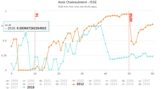
This dashboard brings information about yield, drought index (ISSE), and rainfall for Paraná State in Brazil.
Explaining the Dashboard
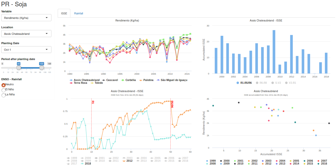
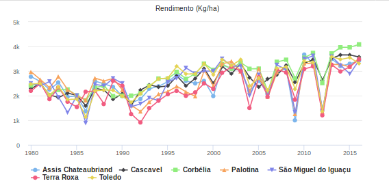
- The first graph shows the yield along the year for different regions. You can also check harvested area and amount produced.
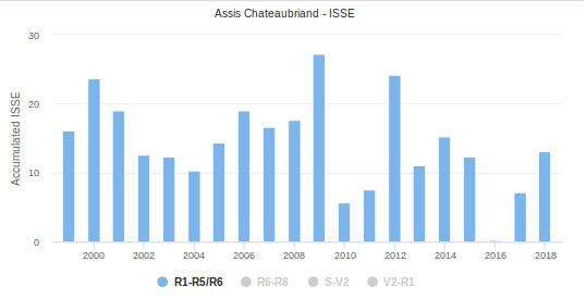
- The barplot on the top right corner represent the accumulated drought index along the years for specific phenological phases such as R1-R5/R6, S-V2.
- The line graph on the bottom left is showing the drought index along the time for different years. It is possible to compare this index along the years through the time. The period of time can be selected with the Period after planting date buttons.
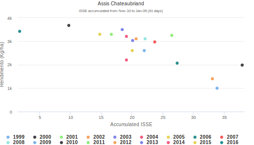
- The last graph from the ISSE page is a scatter plot of Yield x ISSE. Each point represent a year and the accumulated ISSE can be selected using the Period after planting date buttons.
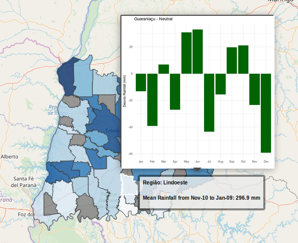
- For the rainfall information I created a map with average of rainfall for each region.It is also possible to click on each region to visualize the rainfall difference for an specific ENSO phase.