

EDA: Brazilian Car Prices
This post is an analysis of a car price dataset from Brazil. The idea is to work with the available data to identify information that lead to price variability.
Reading Data
fipe <- fread("/home/ddantas/project/pre_git/FIPE/data/veiculos_preco_junho_de_2018.csv")
| brand | vehicle | year_model | fuel | price_reference | price |
|---|---|---|---|---|---|
| Acura | Legend 3.2/3.5 | 1998 | Gasoline | June 2018 | R$ 27.942,00 |
| Acura | Legend 3.2/3.5 | 1997 | Gasoline | June 2018 | R$ 23.392,00 |
| Acura | Legend 3.2/3.5 | 1996 | Gasoline | June 2018 | R$ 22.682,00 |
| Acura | Legend 3.2/3.5 | 1995 | Gasoline | June 2018 | R$ 20.648,00 |
| Acura | Legend 3.2/3.5 | 1994 | Gasoline | June 2018 | R$ 18.343,00 |
| Acura | Legend 3.2/3.5 | 1993 | Gasoline | June 2018 | R$ 16.563,00 |
I believe the data is pretty simple and intuitive. Two important points here are: (1) prices are in real (Brazilian currency); (2) price_reference is the moment the price was calculated, in this case it was June 2018.
This information is monthly released by FIPE, a Brazilian instute.
Vehicles by brand
options(repr.plot.width=10, repr.plot.height=4)
fipe%>%
group_by(brand)%>%
summarise(count=n())%>%
mutate(flag=ifelse(count>2000,1,0))%>%
ggplot(aes(x=reorder(brand,-count),y=count))+
geom_col(aes(fill=as.factor(flag)))+xlab("")+ylab("")+guides(fill=FALSE)+
theme_minimal()+theme(axis.text.x = element_text(angle=70,vjust = 0.7))
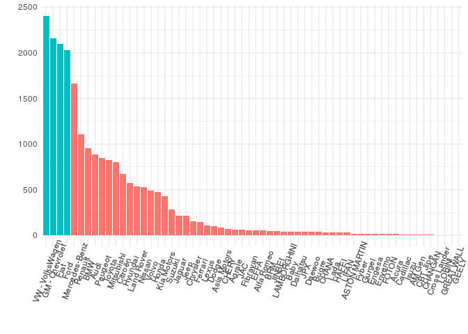
VW, GM - Chevrolet, Fiat and Ford are the top 4 brands of with more than 2,000 vehicles each.
This number takes into account every year model available.
Only Brand New Cars
fipe%>%
group_by(brand)%>%
filter(year_model=="32000")%>%
summarise(count=n())%>%
mutate(flag=ifelse(count>2000,1,0))%>%
ggplot(aes(x=reorder(brand,-count),y=count))+
geom_col(aes(fill=as.factor(flag)))+xlab("")+ylab("")+guides(fill=FALSE)+
theme_minimal()+theme(axis.text.x = element_text(angle=70,vjust = 0.7))
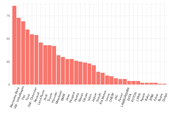
- For brand new cars Mercedes-Benz has the most of number of cars.
- The Next top 4 are the same when account every year model.
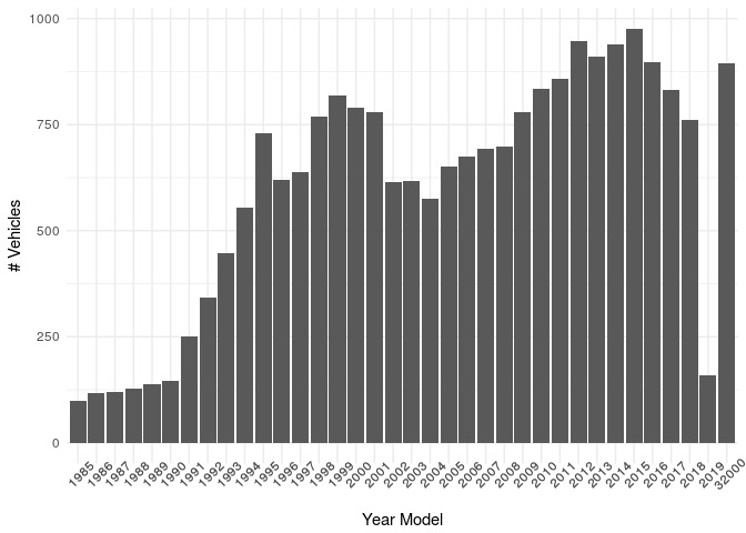
Year Model
fipe%>%
group_by(year_model)%>%
summarise(count=n())%>%
ggplot(aes(x=as.factor(year_model),y=count))+
geom_col()+xlab("Year Model")+ylab("# Vehicles")+
theme_minimal()+theme(axis.text.x = element_text(angle=45))
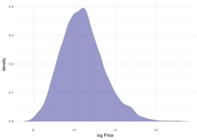
Price
Transform the characther price to numeic format
fipe$price2<-map_dbl(strsplit(fipe$price," "),~as.numeric(gsub("[.]","",gsub(",00","",.x[2]))))
R$ 12.505,00 -> 12505
ggplot(fipe,aes(x=log(price2)))+
geom_density(fill="navy",colour="gray",alpha=0.4)+xlab("log Price")+
theme_minimal()
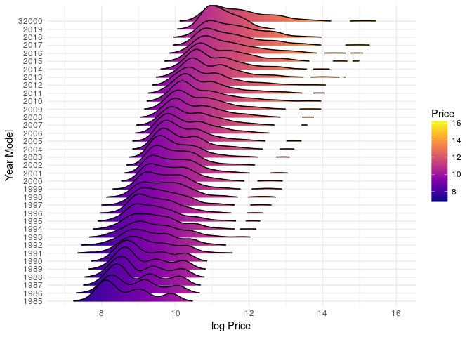
Price by Year Model
options(repr.plot.width=10, repr.plot.height=6)
fipe%>%
#filter(brand=="VW - VolksWagen")%>%
ggplot(aes(x=log(price2),y=as.factor(year_model),fill=..x..))+
geom_density_ridges_gradient(scale = 3, rel_min_height = 0.01, gradient_lwd = 1.)+
theme_minimal()+xlab("log Price")+ylab("Year Model")+
scale_fill_viridis(name = "Price", option = "C")
Create Transmission information
Extract transmission from the vehicle name:
- 156 2.5 V6 24V 190cv 4p Aut. -> Automatic
- A3 Sedan 1.4 TFSI Flex Tiptronic 4p -> Automatic (Because it is Tiptronic)
We cannot classify the cars as manual just because we could not find some indication on its name. It is likely to be a manual transmission but still it we cannot conclude it. For these cases we define as Manual/Not Identified.
fipe<-fipe%>%
mutate(transmission=ifelse((grepl("Aut",vehicle) | grepl("Tipt",vehicle)),"Automatic","Manual/Not Identified"))
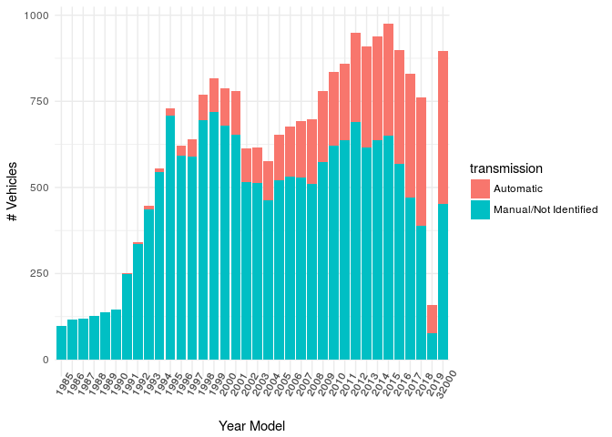
options(repr.plot.width=10, repr.plot.height=4)
fipe%>%
group_by(year_model,transmission)%>%
summarise(total=n())%>%
ggplot(aes(x = as.factor(year_model), y = total, fill = transmission))+
geom_bar(stat = "identity")+
theme_minimal()+xlab("Year Model")+ylab("# Vehicles")+
theme(axis.text.x = element_text(angle=60))
fipe%>%
group_by(year_model,transmission)%>%
summarise(count=n())%>%
group_by(year_model)%>%
mutate(perc=count/sum(count))%>%
ggplot(aes(x = as.factor(year_model), y = perc, fill = transmission))+
geom_bar(stat = "identity")+
theme_minimal()+xlab("Year Model")+ylab("% Vehicles Transmission")+
theme(axis.text.x = element_text(angle=60))
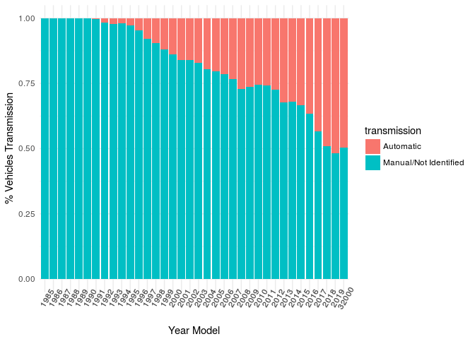
Opposite to the US market the majority of cars in Brazil are manual. However, the automatic car is becoming more popular and increasing its share by year model.
Price by Transmission
ggplot(fipe,aes(x=log(price2),fill=transmission))+
geom_density(alpha=0.6)+
theme_minimal()+xlab("log Price")
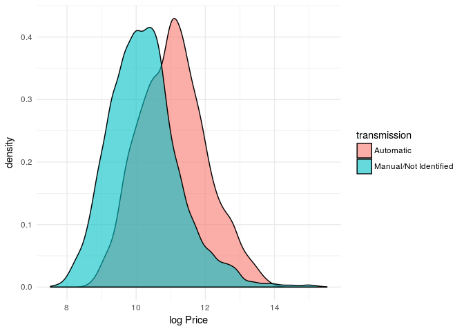
Although it is clear there is a price difference between type of transmission, we must take year model into consideration. The majority of automatic transmission are high year model which helps to increase its value.
options(repr.plot.width=10, repr.plot.height=10)
ggplot(fipe,aes(x=log(price2),y=as.factor(year_model),fill=transmission))+
geom_density_ridges_gradient(scale=2,rel_min_height = 0.01, alpha=0.6)+
geom_vline(xintercept = c(10,12,14),lty=2,colour="navy")+
theme_minimal()+xlab("log Price")+ylab("Year Model")+
facet_wrap(~transmission)
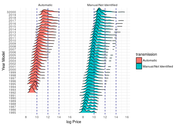
It seems that automatic car tends to be more expensive than the manual.
For manual cars, it is easy to visualize that the distribution for some year models (e.g., from 2005 to 2010) is compound by two different groups.
options(repr.plot.width=10, repr.plot.height=4)
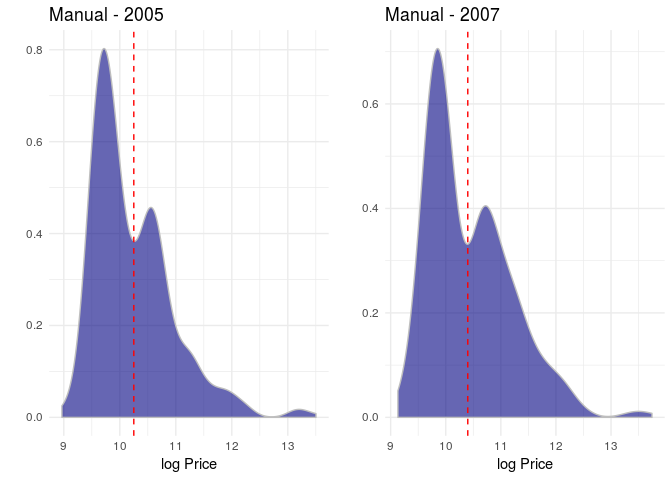
p1<-ggplot(filter(fipe,year_model==2005, transmission!="Automatic"),aes(x=log(price2)))+
geom_density(fill="navy",colour="gray",alpha=0.6)+
geom_vline(xintercept = 10.25,lty=2,colour="red")+
theme_minimal()+xlab("log Price")+ylab("")+
ggtitle("Manual - 2005")
p2<-ggplot(filter(fipe,year_model==2007, transmission!="Automatic"),aes(x=log(price2)))+
geom_density(fill="navy",colour="gray",alpha=0.6)+
geom_vline(xintercept = 10.4,lty=2,colour="red")+
theme_minimal()+xlab("log Price")+ylab("")+
ggtitle("Manual - 2007")
grid.arrange(p1,p2,ncol=2)
Fuel
fipe%>%
group_by(year_model,fuel)%>%
summarise(count=n())%>%
group_by(year_model)%>%
mutate(perc=count/sum(count))%>%
ggplot(aes(x=as.factor(year_model),y=perc,fill=fuel))+
geom_bar(stat='identity')+
theme_minimal()+xlab("Year Model")+ylab("%")+
theme(axis.text.x = element_text(angle=60))
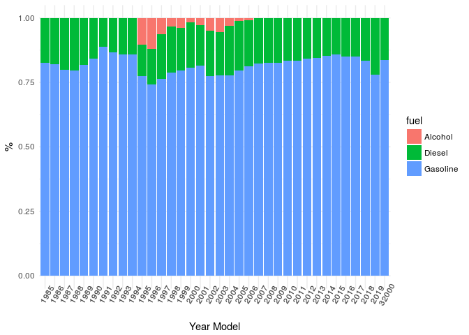
Diesel is very common for trucks and heavy vehicles which usually have a higher price.
This could help to explain the peaks in the price distribution by year model. Specially for the manual vehicles which have more than 85% of the diesel cars.
knitr::kable(
  fipe%>%
    group_by(transmission,fuel)%>%
    summarise(count=n())
  )
| transmission | fuel | count |
|---|---|---|
| Automatic | Diesel | 496 |
| Automatic | Gasoline | 4394 |
| Manual/Not Identified | Alcohol | 378 |
| Manual/Not Identified | Diesel | 3040 |
| Manual/Not Identified | Gasoline | 13489 |
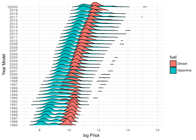
options(repr.plot.width=10, repr.plot.height=10)
filter(fipe,fuel%in%c('Gasoline','Diesel'))%>%
ggplot(aes(x=log(price2),y=as.factor(year_model),fill=fuel))+
geom_density_ridges_gradient(scale=2,rel_min_height = 0.01, alpha=0.6)+
theme_minimal()+xlab("log Price")+ylab("Year Model")
Model
fipe<-fipe%>%
mutate(year_model2=ifelse(year_model==32000,2019,year_model))

model <- glm(price2~as.numeric(year_model2)+fuel+transmission+brand,
             data=fipe,
             family = Gamma(link = "log")
             )
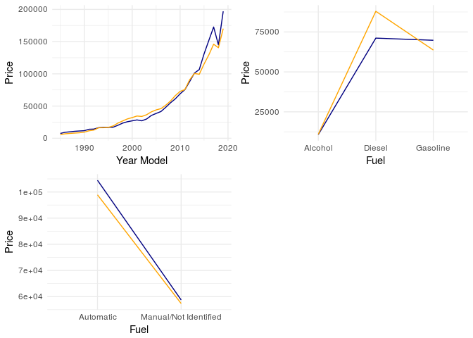
Real (blue) x Estimated (yellow)
options(repr.plot.width=10, repr.plot.height=4)
p1<-fipe%>%
mutate(est_price=predict(model,.))%>%
group_by(year_model2)%>%
summarise(price=mean(price2),est_price=mean(exp(est_price)))%>%
ggplot()+
geom_line(aes(x=as.numeric(year_model2),y=price),colour="navy")+
geom_line(aes(x=as.numeric(year_model2),y=est_price),colour="orange")+
theme_minimal()+xlab("Year Model")+ylab("Price")

p2<-fipe%>%
mutate(est_price=predict(model,.))%>%
group_by(fuel)%>%
summarise(price=mean(price2),est_price=mean(exp(est_price)))%>%
ggplot(aes(group=1))+
geom_line(aes(x=fuel,y=price),colour="navy")+
geom_line(aes(x=fuel,y=est_price),colour="orange")+
theme_minimal()+xlab("Fuel")+ylab("Price")

p3<-fipe%>%
mutate(est_price=predict(model,.))%>%
group_by(transmission)%>%
summarise(price=mean(price2),est_price=mean(exp(est_price)))%>%
ggplot(aes(group=1))+
geom_line(aes(x=transmission,y=price),colour="navy")+
geom_line(aes(x=transmission,y=est_price),colour="orange")+
theme_minimal()+xlab("Fuel")+ylab("Price")

grid.arrange(p1,p2,p3,ncol=2)
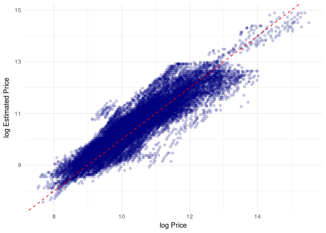
Error (Real - Estimated)
fipe%>%
mutate(est_price=predict(model,.))%>%
ggplot(aes(x=log(price2),est_price))+
geom_point(colour="navy",alpha=0.2)+
geom_abline(intercept = 0, slope = 1, lty=2, colour="red")+
theme_minimal()+xlab("log Price")+ylab("log Estimated Price")
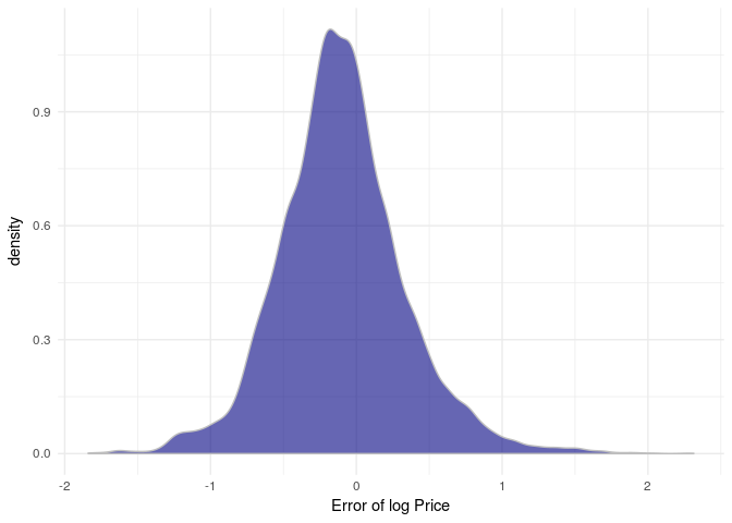
fipe%>%
mutate(est_price=predict(model,.),
      error=log(price2)-est_price)%>%
ggplot(aes(x=error))+
geom_density(alpha=0.6,colour="gray",fill="navy")+
theme_minimal()+xlab("Error of log Price")
Conclusion and Discussion
- Based on basic information for vehicles such as year model, and fuel it is possible to describe price.
- Created transmission information from the vehicle name. This information seems to be related to the price.
- Other simple variables such as wheter the car is imported could also impact be an important information for the price.
- The model with few variables was able to quantify relation between the variables and price. As said before, there are definetly other variables that could help to better explain price variability.
- The model seems to be overestimating since most of error are negative.
- The idea here was to give an example of EDA.